Monday, June 20, 2011

Carpenter Joe - Copic Coloring

HUGE BLOG HOP LATER THIS WEEK.. STAY TUNED....
GREAT BLOG CANDY!

Today's image is from Tiddly Inks be sure to stop by her blog to check out the fun and cute images. I especially love this one because it's a masculine image that I can use for many occasions... especially perfect for a thank you card for my son after he paints the trim on my house... LOL... I think I better include a check... I mean he is a teenage boy.. $$$ is better than a card!

colors used:
Shirt: YG000, YG21, YG25
Overalls: B91, B95, B97
Wood/Pouch/Hair: yr21, E33, E35, E37
Ground: W1, W3, W5
hammer: C1, C3
Face: E00, E02, E11
Backround: B000

Saturday, June 11, 2011

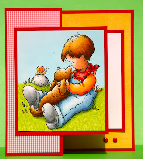
Highlights & Shading - Using a Light Source Template

I love this image... I used the light study guide from Marianne Walker's book to help with the placement of highlights and shadows on this image. I am teaching highlights and shadows in many Southern California stores.. check my calendar or email me for the class closest to you.

The finished project shown first is just repeating the same steps as described below for each part of the image IE: hair, jeans, shirt, dog etc...
In the first small photo, you can see the light source guide placed on top of the image. I used a light piece of removable adhesive so that I would not have to figure out the placement each time I lifted the template.
Before starting to color any image, I suggest that you study the photo to determine where you are wanting your light source to come from. Take into consideration the face or main focus of the image... normally you would want to have your highlight on the most important portion of the image. In this case, I wanted the light source to come from my upper left. If I had the light coming from behind the boy, they face of both the boy and dog would have been shaded rather than highlighted.


1. lay light source guide over image with the lines running the direction of your light source. Use a bit of removable adhesive so that the template will not shift placement when you lift to color on your image. I make sort of a hinge with the adhesive so that I can repeat lifting the template and replace it repeatedly.
2. I mark my template with a yellow marker everywhere I believe the light is going to hit first. That is where the color is going to be the lightest or have the most white. Then I used blues to determine where I am going to place my shading and shadows. Obviously the shading is going to be darkest where the light hits last or indirectly. IE: the back side of his jeans. The Cast shadow is also shown in gray. Note the cast shadow is the area where there is grayness cast onto another subject (ground) due to the image blocking the light.
3. I then color each portion of the image individually. I start with the lightest color first and try to work on a damp surface. I add my mid tone, and then add my shading color. Using less of each color as I go darker. I then blend out my colors using the lighter color. IE: b91, B93, B95 I would use B91 to blend where the B91 & B93 join, yet I would use the B93 to blend where the B93 and B95 join together.

Using a light study guide helps me keep my highlights and shading consistent rather than randomly all over the place.... LOL which I often do when I am not using a guide. I have to make myself use a guide, because using one seems like such a bother to use... LOL.. but the outcome is so worth the few minutes it takes to get started.
Image: Penny Black (love it)
Colors used:
Hair & Fur: YR31, E30, E35, E37
Denim: B91, B93, B95 B000, Blender
Shirt: YR31, Y35, Y38 and a bit of YR68
Face: E000, E11, E04
Grass: YG21, YG23, YG25, and a bit of YG63 using my dots & doodles technique.
Baseball: N1, N3, N5
Bandana, R21, R22, R27, R59
Shoes: N1, N3, N5 & a bit of N7
Sky: B000 (colored not airbrushed)

Have fun!
Colorful Hugs to Everyone!

Wednesday, June 1, 2011

coloring white.....Copics..


Here is a quicky five minute card... I used only a few colors! Honest - the entire card was done in five minutes! Even less time that it takes a baby to outgrow these shoes!

W1, W4, Blender, N1, B00, B12..... just colored the shaded areas with warm grays on the shoe, and N1 on the shoe lace... Easy Peasy!

Image by Peddler's Pack in Beaverton, Oregon

What A Dopey Day!


Hello Everyone!
I am in Washington loving life. I have got to visit with Austin (my son) since Sunday. I cherish every minute I get with him. Tomorrow night he is in an ASL concert (sign language) and I get to to watch him and his girlfriend. I am so excited.

I planned on coloring tons of things while Austin was in school, but forgot my markers! YES.. can you believe it.. that's what happens when you wake up at 4:35 and should have been at the airport at 4:30.. oh well.....

Here is an image I colored last week. I was going to make it into a card before I posted it, but feeling Dopey for leaving my markers at home, I thought I would post it today.
These pics are of me playing and being silly at the Artful Horizons event in Palm springs hosted by Donna Salazar, Jennifer Priest and Laura Miller. I had a grand ole time! The tea party was fun, and gave me time to do a few make and takes and act silly. The event was WONDERFUL. There were also some fun vendors from who I ordered fun stuff from... Scency and 31.. oh Yea... my wallet was empty when I left. LOL.... but lots I earned lots of raffle tickets and won a great prize... amazing prize that is.....a bag full of goods!

Ta Ta For Now... Look forward to some Airbrush projects to be posted this weekend.. Whew Hew!

HUGS...