ALCOHOL MARKER INSTRUCTOR AND SPECIALIST. As former Certification Instructor for both Copic and Spectrum Noir, I have a wide variety of knowledge to assist all types of alcohol Markers... Now also teaching watercolor stamping and assorted card classes.
Tuesday, February 15, 2011
Light source

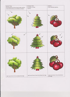
Finding your Light source
Highlights - where the light first hits your image. We show a highlighted area by absence of color or a lighter color. Highlights are normally shown by using Copic colors ending with numbers like OOOO, OOO, up to markers ending in 03.
Shading - Where the light hits less than than another place on the image, but not the darkest. AKA mid-tones. This is your main color normally a Copic color number about 2 numbers brighter than your highlight color or numbers ending in no higher than a 5-6.
Shadows - Where the light hits least or not at all. This is normally shown by using a grayer or darker color.
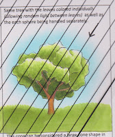
Cast Shadow -A cast shadow is formed due to light not being able to pass through an object. The cast shadow simulates the image or object that is blocking the light. A cast shadow is not always gray, but a muted or darker color of the image it is revealing itself on. IE: The tree is casting a shadow on grass that was colored with YG03, I colored the shadow with a YG63 which is a grayer shade of YG03. I could have reached a similar outcome by shading with a N3.
 age.
age.
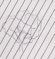
Let's start by doing a light study prior to starting to color our image. This is done with a Lighting Guide Template which can be made on a transparency with lines drawn on it. The lines represent the light. As light travels in straight lines.
 one round image but several clumps of greenery. Each section is treated separately and as related to the others (ie: behind, in front of etc).
 Wednesday, February 9, 2011
Intermediate Certification Class - Phoenix
Phoenix is a hot spot for Copic Certifications... we will be holding an Intermediate Certification Class in Phoenix on April 11th. Registration is opening this week. Be sure to fill out your application and return it ASAP. This class is expected to fill and have a long waiting list.
However.... please I encourage everyone that wants to attend to fill out an application! It is easier to get into the class than some think. We just want to make sure that you understand how to blend two colors together, and a few other basic Copic techniques. I honestly believe that this amazing class will help ANYONE wanting to improve their coloring.
INSTRUCTORS: The Amazing Debbie Olson & Colleen Schaan... both wonderful artists and instructors. You will be in awe! I will be there as well... Hope to see you there.
Hurry and fill out that application! www.copicmarker.com under the certifications button (great new website is very user friendly)
Friday, February 4, 2011
February Copic Card Classes - Stampendous
